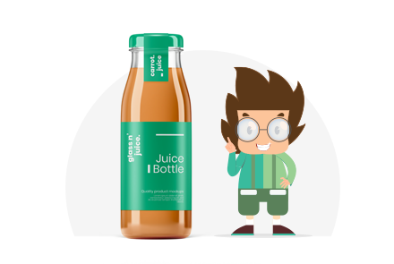
7 Things to Consider When Making a Product Label
Retail
![]() LAST UPDATE: OCT 15, 2022
LAST UPDATE: OCT 15, 2022
![]() 6 minutes reading
6 minutes reading
Your clients might find your product to be very beneficial. But in a cutthroat market, that is insufficient to make the product popular. You must take extra steps to entice customers. While developing a successful marketing campaign should be a top priority, the first thing to keep in mind is your product label, which must be made by a qualified graphic designer.
In this blog, we’ll go over the fundamentals of creating your product label. The most crucial subjects will be covered, including assessing the competition, choosing a reliable printing partner, and understanding which kinds of labeling materials are best for your goods.
What is a Product Label?
Customers are informed about the contents of a product’s package via its label. Beyond merely the product name, labels frequently contain additional advertising material.
Key characteristics, details on flavors, smells, or other product specifics are a few examples of what they might contain. The product label must also include nutritional information in a very precise way whether you’re selling food or a supplement.
Why It’s Important to Properly Identify Your Goods
It’s important to make product label that are correct for two reasons. First off, a label that makes promises that the product can’t keep would seriously undermine consumer trust. Second, in other to the stringent FDA requirements, many products, including food items and supplements, must have highly particular labels. Customers are happier when labels are accurate, and it also helps you avoid problems.
Here Are 7 Guidelines for Creating Product Label
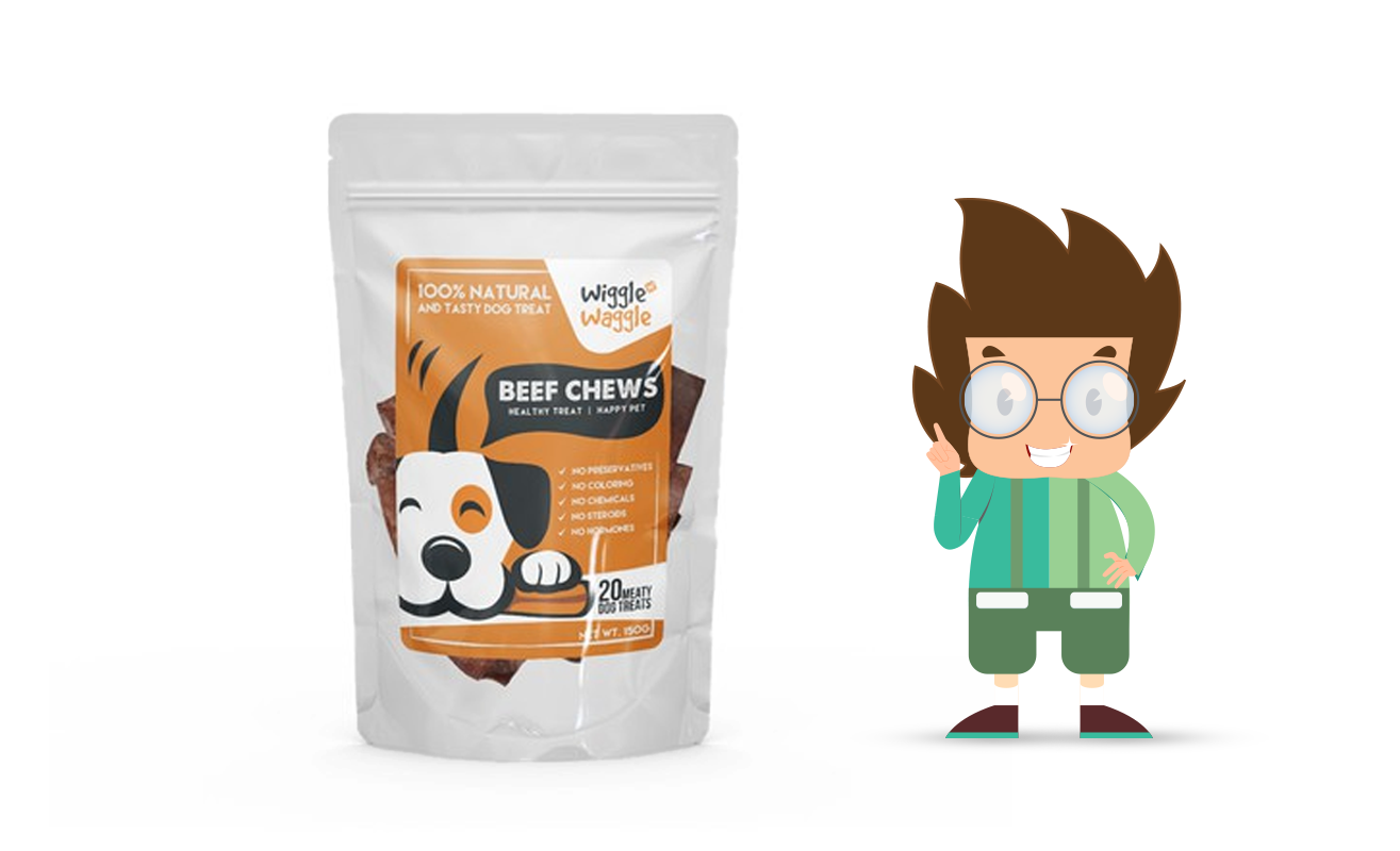
A shopping shelf is lined with many different items. If the label is appealing and distinctive, potential customers will notice your product right away. Even clients who aren’t sure can consider purchasing your product based on its distinctive label.
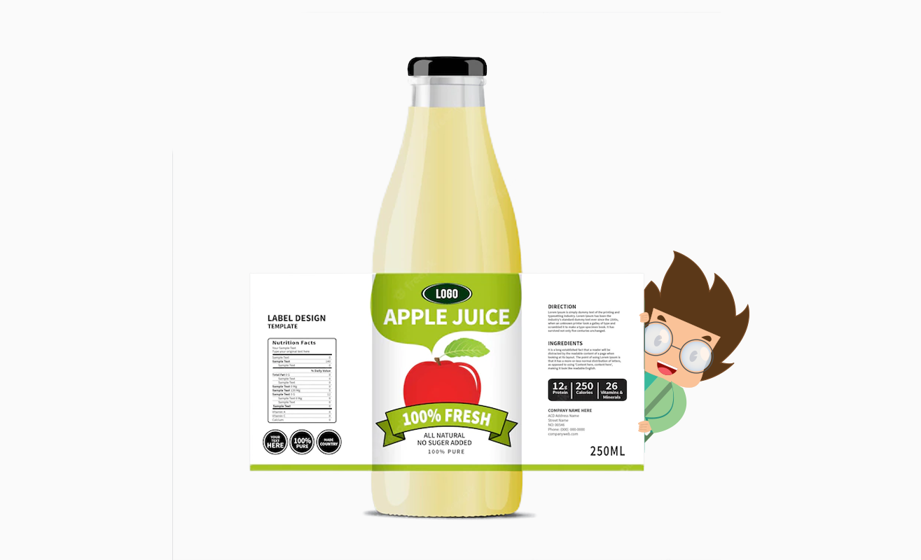
1. Enhanced Readability
A shopping shelf is stocked with a wide variety of goods. Potential clients will immediately notice your product if the label is appealing and recognizable.
Make sure customers may nevertheless think about buying your product based on its distinctive label. Make sure that the text is readable when designing a label. The font size should be suitable for clear reading of the label from a good distance.
The text should ideally be larger than 6 points, at the very least. Font sizes of 10 points and higher may be utilized for the other pertinent information listed.
The font color should contrast with the backdrop color to further improve readability. However, try to avoid using an unconventional color scheme. So, pick a font color that has contrast in both value and intensity. According to consumer psychology, choosing a bright color is preferable since it inspires confidence in the viewer. The color tones should also match the brand’s current visual aesthetic.
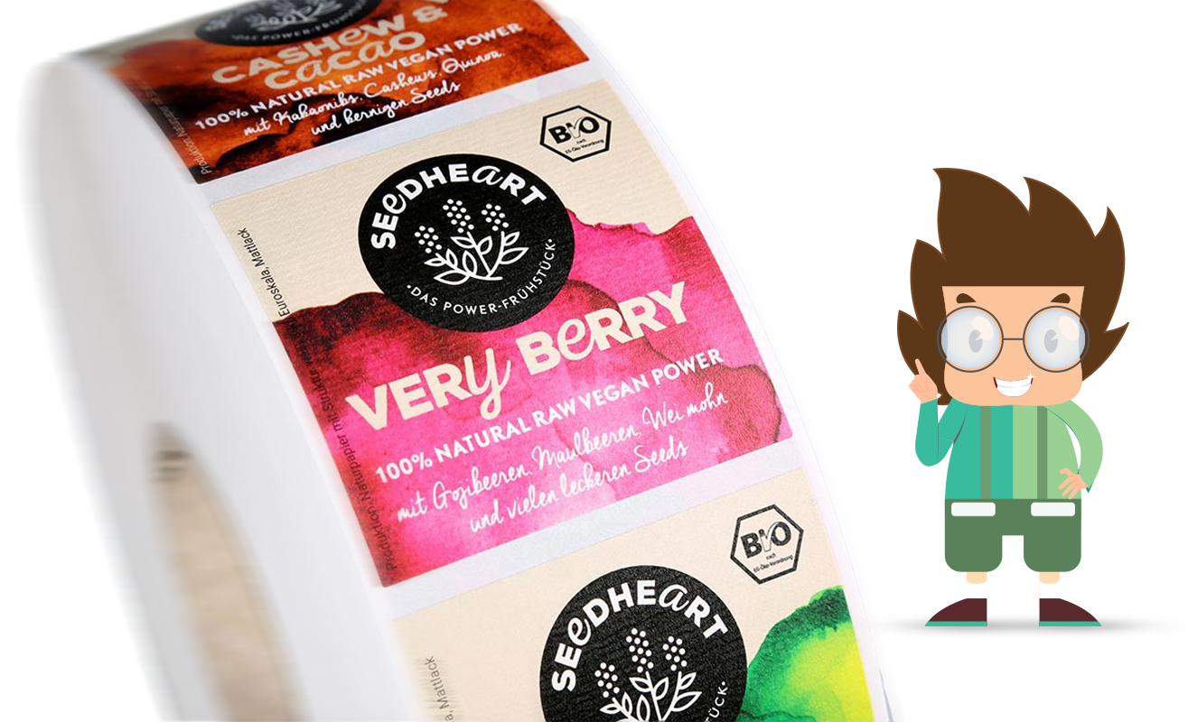
2. Be Watchful of Typographic Pairing
Since a product label has usually little space for image and content, Designers use the limited space on a product label for both the image and the text to create visual contrast.
With the use of contrast, viewers may quickly identify the various pieces of information. If there is a need for consistency between information, it is advised that you utilize the same typeface.
Typographic pairing’s major goal is to show how information and various type choices relate to one another. Use fonts that represent the characteristics of the product to further increase the design’s impact.

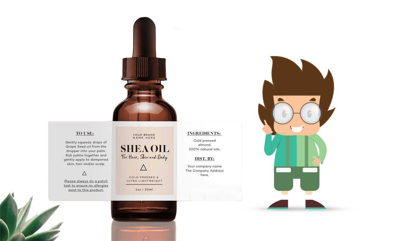
3. Emphasis on the White Space
The areas of a design that the designer does not use for photos, text, or other illustrations are known as white space. In other words, it is the hue of the design’s background.
A product label template can be used to make a product label that includes white space, which is an important design component.
White space makes it easier for clients to read the specifics by dividing the various informational bits. Additionally, it serves to distinguish objects visually.
The packaging design has a minimalist appearance due to white space. This gives the design a refined appearance. It indicates the product’s serenity. For this reason, white space is crucial when designing a label for goods like infant supplies, cosmetics, and similar items.
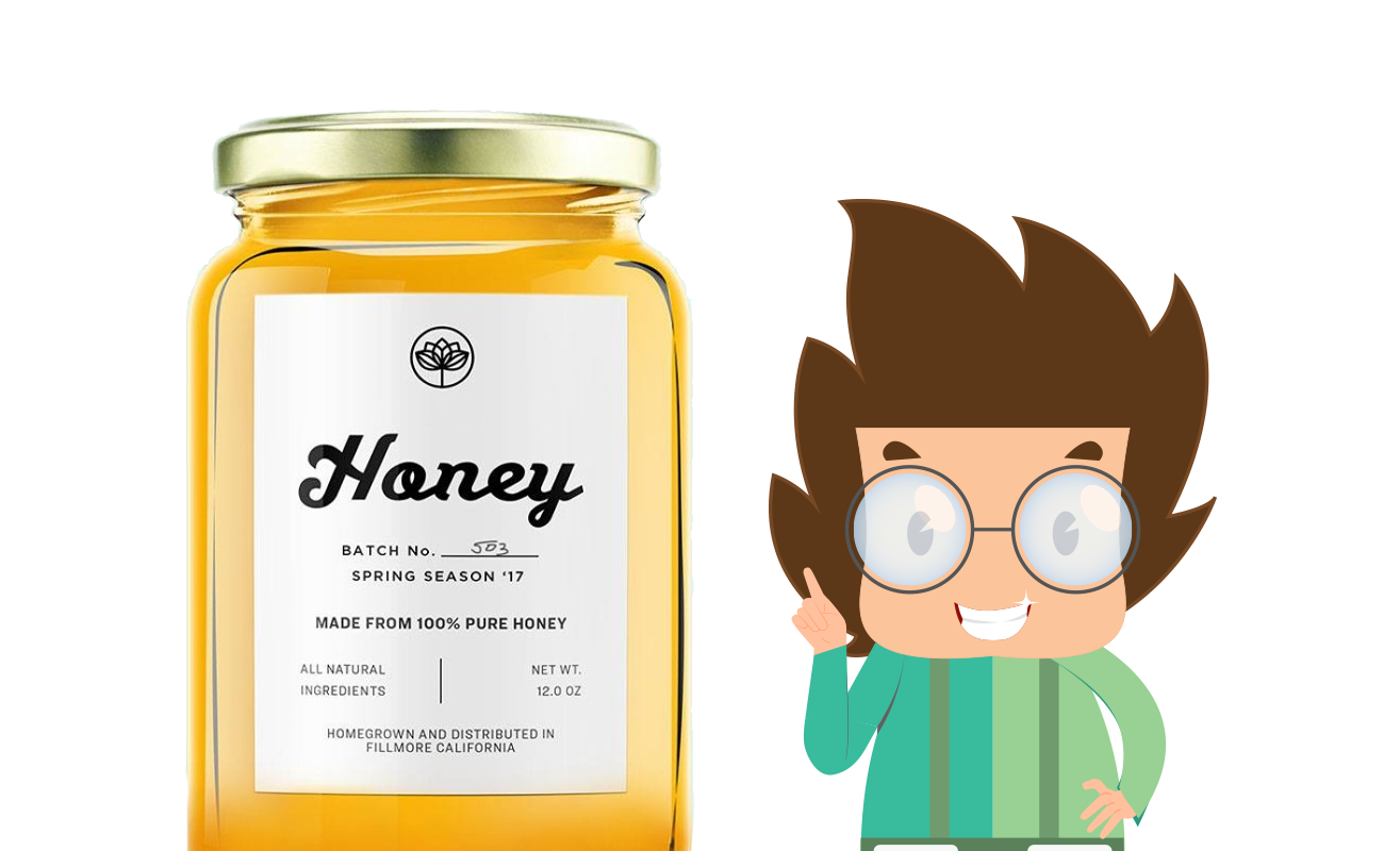
4. Illustrate
Graphic design and art elements are necessary for some product labels. When you need to talk about the product labels. When you need to talk about the product visually, you use it. You can clarify things with the aid of an internet packaging design service provider.
For instance, the color scheme and illustrative images on a product label for fruit juice or jellies are entirely different. Simple would not be effective for them. Sometimes a decent option for such labels is to choose abstract ink drawings.
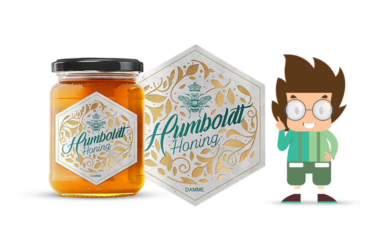
5. Maintain Originality
Graphic design and art elements are necessary for some product labels. When you need to talk about the product more visually, you use it. You can clarify things with the aid of an internet packaging design service provider.
For instance, the color scheme and illustrative images on a product label for fruit juice or jellies are entirely different. Simple would not be effective for them. Sometimes a decent option for such labels is to choose abstract ink drawings.
Do not add anything to the design that is unrelated to the product only to improve its appearance. A crucial component that needs to be explicitly specified in the design is the barcode.
6. Consider The Product Label Size for Designing
For product packaging, the design strongly depends on the size of your product label. Your customer can insist that the label be used on both the front and back of a single product. It might also only apply to the front label.
When many labels are needed, the front face typically only carries the brand name and emblem. The remaining details are thrown in the back.
However, a single “wrap-around” label is thought to be more economical by many designers. Additionally, it provides a more attractive design panel and aids in creating a brand identity.
7. Concentrate on Print Quality
The last, but by no means least, thing to think about is to make sure the label is printed well.
For a favorable initial impression, try to improve the product’s visual presence with high-quality cards. Get a professional to make it for you whether you want a glossy, matte, or coated finish.
When considering how to design a distinctive product label, take into account some crucial suggestions. But you are not required to pay a high-priced designer to complete the task. You may easily buy a distinctive label for your startup or small business.
Final Thoughts
A new product launch is a thrilling endeavor. You now have the resources you require to start the process after understanding the fundamentals of producing a high-quality label. The label has a significant role in a consumer’s initial perception of your product. Therefore, be sure to design a product label that showcases your goods in the best possible way. After all, second chances are uncommon, particularly in the retail industry.

Recent Comments